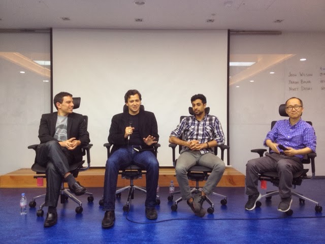
Monday, November 25, 2013

[Personal UX/UI review] importance of designing in customers' view


Issue: blocking view of average Korean adult passengers

Recommendation: lower the black bar for better view

Sunday, November 24, 2013

[Personal UX/UI review] User control

<Product: Google Map web page on Safari>
Positive: convenient quick access button to full fledged app or download

Issue: no close button on screen

Recommendation: provide an exit button for full screen view

Lesson: usability rule#3 let users control app


Tuesday, November 19, 2013

[Personal UX/UI review] signage designs and promotional message in subway

Positive: positive expression for restrictive message

Context: The yellow flyer states "We welcome credit cards for 5,000 KRW or above purchase" where the sales person could have said "We don't take credit cards below 5,000 KRW." I thought that this is a smart approach to turn a negative message to positive. 

Positive: simple but intuitively understandable 

Lesson: symbolize things if they are common to users 

Issue: both signages have the same direction (redundancy) 

Context: The signage on the left and right both included opposite end destinations. If you are a first time visitor for this station following colors and station names, you will stop and wonder at least once at the signage to make sure you're heading down to the correct path. This is unnecessary because choosing either path will lead to the same second floor of this subway basement. Passengers don't need to stop here and spend time to choose directions but stop on the second floor of the basement because redundancy means inefficiency which leads to wasting people's precious time.

Recommendation: if two directions on signages are the same, delete both directions and leave them empty to avoid confusion and unnecessary time for passengers to stop to figure out which one goes where


Sunday, November 17, 2013

[Personal UX/UI review] Fitt's Law on lip moisturizer

<Product: Neutrogena's lip moisturizer>
Positive: less hand movement on moisturizer by putting rotation component right below of a cap 

Lesson: even in real-life (or "offline") design, less movement works! (c.f. Fitt's Law application on for online products)

[Personal UX/UI review] Apple iOS's standby mode for Voice Memos

<Product: Apple iOS 7>
Issue: when wanting to stop recording after users' screen went black, we need to unlock the phones first 

Recommendation: provide a stop icon for Voice Memo even on standby mode (c.f. Podcasts' app's standby mode below)


Sunday, November 10, 2013

[Personal UX/UI review] Google Sheet's plus button location

<web app: Google Sheets>
Issue: forcing users to make an unnecessary mouse movement to all the way to the left whenever making a new tab

Recommendation: move the plus button ("+") on the right side of the last worksheet tab of the far right

[Personal UX/UI review] Jihachul's history and iOS's scroll-down summary

<app: Jihachul>
Positive: history function readily available when searching for a subway station 

Lesson: always consider providing a 
menu of users' most frequently selected function 

<function: scroll-down summary on iOS>
Issue: displaying a useless space even when there is no schedule

Recommendation: shrink the Calendar space to fit schedule amount (e.g. if no schedule, shrink the space all the way!)

Tuesday, November 5, 2013

[Personal UX/UI review] TV screens inside of subway

Issue: no indication on next stop on screen

Recommendation: always include next stop conveniently on screen so that passengers don't need to look around to find one 

Saturday, November 2, 2013

[Personal UX/UI review] success factor for a chicken franchise

Positive: 
1. convenient food- chickens with no bones providing a sense of relief in eating chicken
2. simple menu choice- mainly two (i.e. sweet, spicy) providing easy selections for a quick bite
3. transparency in food making- visible food process satisfying hygienic needs 

Recommendation: provide a pricing of  6,000 KRW for a half and half menu (i.e. half sweet and half spicy) to fill in the niche needs to have both 
(c.f. In Korean culture, people love sharing food; part of the reason for sharing is to fulfill curiosity for other options or perhaps to have it all with psychological reasons. For example, this curiosity concerning food in its "ultimate" form can be portrayed in mixed food menu (aka 짬짜면) as commonly found in Korean Chinese restaurants.)

Thursday, October 31, 2013

[Personal UX/UI review] signs in Seolleung Stn. perhaps

Issue: the ceiling sign has misled me not to go under the sign but look for an exit sign located on the far left on this photo

Recommendation: include exit numbers in the ceiling sign for passengers' intuitive understanding of direction 

Tuesday, October 29, 2013

[Personal UX/UI review] Samsung Electronics newspaper and light box ads

Issue: still hardware specs ads
(c.f. Samsung's video ad: http://www.samsung.com/africa_pt/?brightcove=2748971527001#latest-home)

Recommendation: advertise how the optical zoom and smartphone combination enhance people's lives 

Issue: information architecture of this light box display is not intuitive enough to understand which text explains which picture

Recommendation: visual categorization of information needs to be implemented 
For example, 


Friday, October 25, 2013

[Personal UX/UI review] 2nd floor store design, logo positioning,pricing

Positive: clean window and bright lighting for 2nd floor restaurant

Lesson: to attract customers on the 2nd floor, deal with issues that customers care the most (e.g. hygiene, doubts about shaggy business) 

Issue: no logo

Recommendation: put logo in front of company name to increase brand recognition and awareness

Issue: same product with different pricing

Recommendation: standardize pricing (i.e. make the price the same)

Tuesday, October 22, 2013

[Personal UX/UI review] Google Drive's lack of system detection

Issue: though users already downloaded the application, this Google Drive, a cloud-base web application doesn't detect that (c.f. Google+ doesn't detect installed app on users' smartphone, either) 

Solution: if installed, simply remove the icon from users' Drive webpage

Lesson: website needs to be able to "customize" or "respond" to users' current system 

[Personal UX/UI review] McDelivery site and alarm app from McDonald's

Usually on weekends, I find myself visiting Korean McDelivery site to order burgers and stuff. The other day I happened to notice time-limitation sales technique widely used by TV home shopping channels has been implemented in McDonald's home-delivery website. 
Positive: display remaining time for selected order to psychologically influence users to convert from website visitors to purchasers

Positive: "kind" reminder message to nudge users for purchase

Positive: as a "punishment" failed to click order button, users need to start all over again. What a great incentive system! 

Positive: even a utility app which comes with free coffee promotion displays timer-limitation; this system truly works because the system incentivized me to visit the restaurant this morning! 


Friday, October 18, 2013

[Fireside Chat] Lessons Learned from Y Combinator & 500 Startups

Title
Fireside Chat- Lessons Learned from Y Combinator & 500 Startups
Place
D Camp
Time
October 16, 2013 7PM~9PM
Speaker
Niket Desai (@niket), Josh Wilson (@makaniaki), Yaron Binur (@ybinur)
Organizer
AppCenter (http://onoffmix.com/event/19682)
Focus
What to do in startups


I.       Key Takeaway: 
1.       Move fast, stay hungry and focused
2.     Stay with customers from day zero      

II.      Lesson from Y Combinator
1.       What you’re building should be meaningful to users
2.     Your product or service needs to make users would be willing to pay for it, download it, or come back periodically
3.     Talk to your customers and speed up (bringing your prototype and getting feedback are so much faster than coding)
4.     No need to waste time and money on managerial stuff e.g. payroll, tax, etc. (use accelerator program such as Y Combinator)
5.     Know why you need an accelerator before asking one  

III.     Other lessons
1.       Get more feedbacks early
2.     Utilize usability, user testing, surveys from day zero
3.     Always sell yourself (i.e. elevator speech to other people)  

IV.    Ways to be acquired
1.       Visibility: Get yourself known (e.g. Top 50 Tech Crunch)
2.     Be focused (e.g. home related thing for Redbeacon)
3.     Make hard decision in valuing and selling your business

V.      How do you see failure?
1.       Fail fast and early and often (c.f. Paul Graham)
1)     Fail consistently every time (B/c with failure you learn something)    

VI.    Go to Silicon Valley to build or stay in Korea?
1.       go global and support multiple languages (e.g. Skype started as global service from day one)
2.       know what you’re doing (e.g. non-consumer facing products such as security, technology, infra doesn’t need to be physically in the States)

VII.   Where to locate HW and SW offices?
1.       be where your customers are
2.     learn from Waze- R&D center in Israel but operation offices in the US

Tuesday, October 15, 2013

[Personal UX/UI review] front yard design trend?

Some similarities found for front yard design among shops. A trend?


Observation: wooden look front yard design 


Issue: hard to see what's this restaurant is selling; the front yard design seems to be closed

Solution: get rid of plants and make it open like the cases above perhaps?


[Personal UX/UI review] empty space utilization of Yangjae Station

I was just passing by Yangjae Station and realized there have been too much empty spaces which could have been utilized for passers-by and the New Bundang-line company. 

Positive: good usage of empty space

Lesson: space= opportunity

Saturday, October 12, 2013

[Personal UX/UI review] Google Plus,Google Drive API,G+ comment UI,G+ mobile menu,Ads made in Korea

Positive: great UI. Under one line restriction, the designer managed to show multiple comments by showing overlapped images

Lesson: to provide a great UX, no need to have a large space

Positive: same UI as desktop to reduce learning time 

Positive: efficient API allowing easy slide switch

Issue: terrible cases of Korean company ads. They almost always have to use pretty models for getting their message crossed to viewers. How sad!!!

Solution: make products to become viewers' attention by displaying common looking people without distractions; learn from ads made during Steve's reign! 

Friday, October 11, 2013

[Personal UX/UI review] Korean design, rice pack seal, McDonald's doorand trash can

Positive: using Korean alphabets to create beautiful consumer products

Issue: no intuitive way to know how to open rice pack

Solution: follow people's mental models by imitating other common tearing solutions with popular FMCG products 

Lesson: we often hear differentiate, differentiate and differentiate your products from others; however, copying the best practices may not necessarily a bad thing

Issue: people accidentally bumped into this glass without knowing that the glass is not a door at least once in every hour of my sitting

Solution: put some ads or visual stuff to cover so that from afar people can perceive the glass not as a door or path 

Issue: I don't know where to put my trash separately

Solution: display a visual key by adding a territory sign e.g. plastic cup, mug cup, water dispensing area

Lesson: make customers' last journey or touch point of their store visit a pleasant memory by intuitively guiding them with stress-free design


Tuesday, October 8, 2013

[Personal UX/UI review] designing signs on architecture

I was passing by below buildings the other day and what designers did to their buildings caught my eyes. 

Positive: displayed a communication channel to passers-by

Positive: targeted on one thing instead of many: positioned its place for studying people 
Issue: displayed no recognizable signs (though its services may be provided during day time, the color is not noticeable); repeated same logos all around without sending a particular message

Solution: color SONY sign to be catchy; put some catch phrase around the building to both improve Sony's image and increase the center's physical presence 

Lesson: convert architecture signs to a communication tool to passers-by

Saturday, October 5, 2013

[Personal UX/UI review] Android KitKat promotion

Received below KitKat from a YouTube event and now I finally participated in the new Android's promotional campaign. 
Issue: wrong URL, QR code not working, wrong location for both URL and QR code

Solution: use kitkat.co.kr instead; place URL and QR code below "STEP 2"


Issue: too much scroll to get to the bottom of the page

Issue: hard to find country section

Issue: color not too much recognizable

Issue: entry style looks dramatically different from others

Solution: make it look similar to others
---
[overall] Lesson: make it easy for customers to participate promotional campaigns

[overall] Evaluation: 2/10 (this promotion could have been easier to participate)